My name is Aaria Bhatnagar. I am from Bergen County, New Jersey. I am a first year student at Quinnipiac University. By my sophomore year, I would like to declare a double major in Communications and Psychology. In high school I was very passionate about the mental health initiative and I was also able to take a journalism class. This peaked my interest in both subjects.

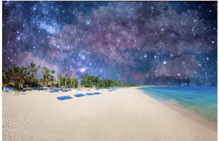
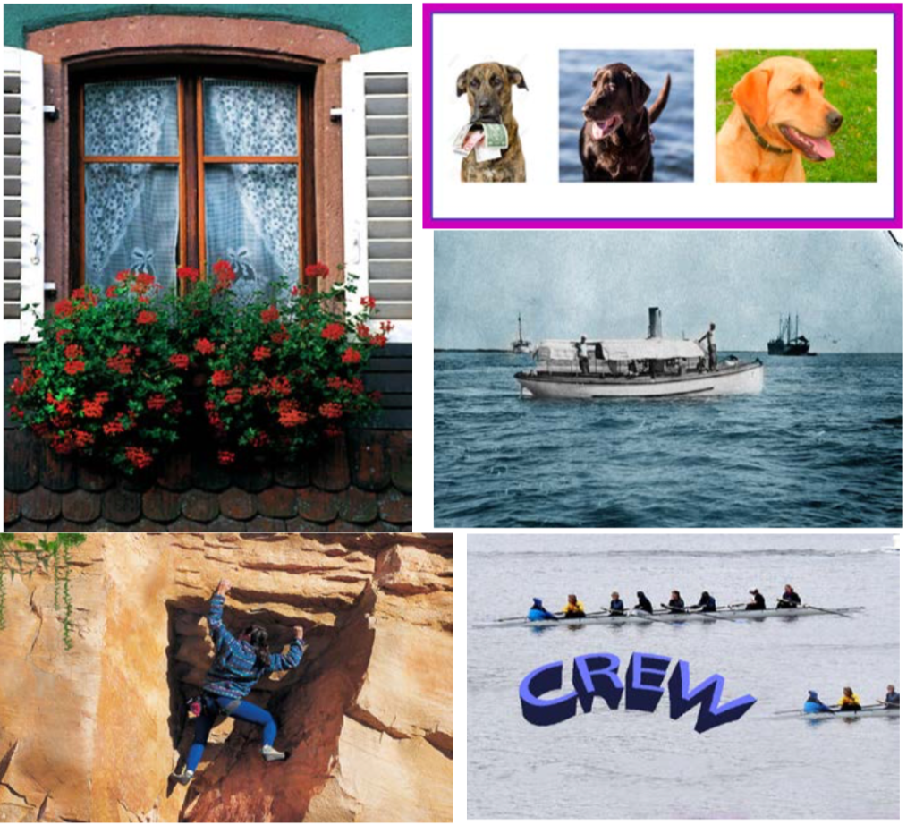
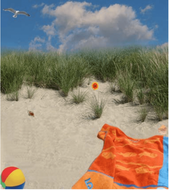
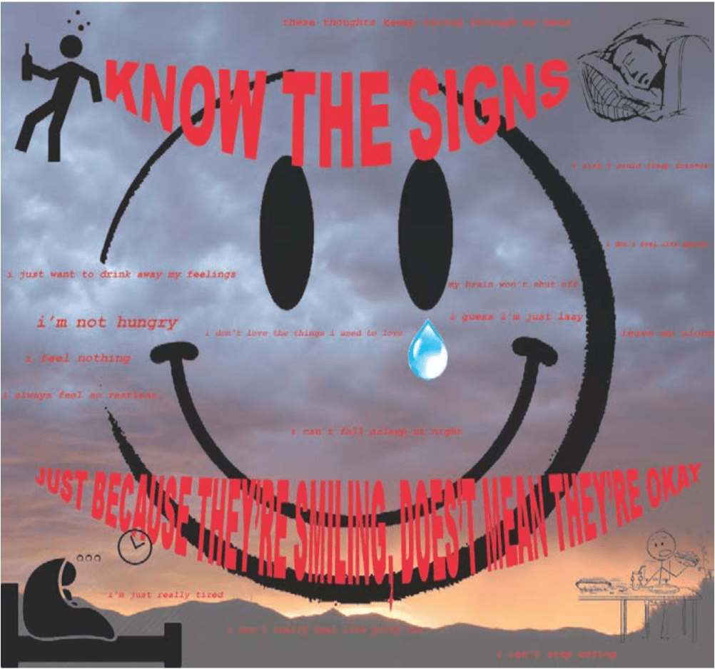
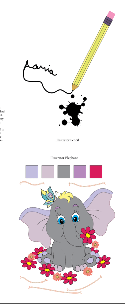
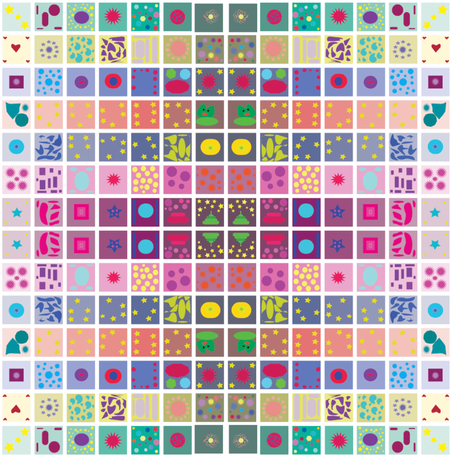
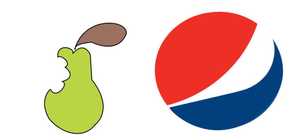
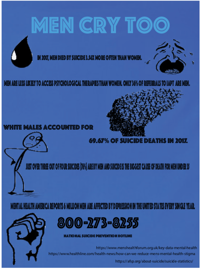
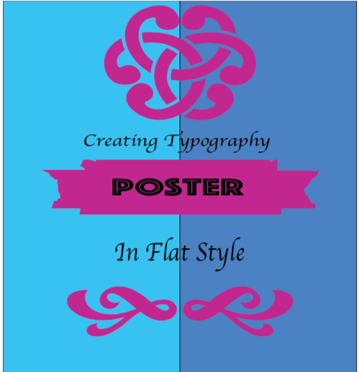
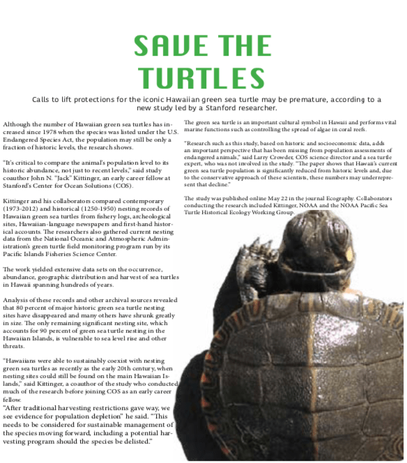
Image Description in Order of Images Above
Photoshop Independent Layer Mask Compositions
I used layer masking in order to place an image of a galaxy behind an image of beach scenery. I was able to make the images blend well into the background so that it’s very hard to tell that there was a difference in the original image. I thought that the concept of a beach in the galaxy was an interesting concept that I wanted to create
Photoshop Retouching
There were several different in class assignments in which we had to retouch different photos using photoshop. In the first image of the window, we straightened it and recolonized it. We also used recoloring in the image of the boat. For the image of the dogs, we were told to make a collage and add spaces in between them and also make the frame a different color. In the rock-climbing image, I added the vine that was originally not there and removed the rope that was originally there. For the image of the Crew team, we duplicated them and I put them in the corner of the screen. We were also told to type crew in a different fashion than the default.
Beach Scene
For this in class assignment, we were given many different images to keep in the beach scene. The challenge was to make it seem very natural. I placed the items in very specific places and made sure that they were proportional to how those items would be in any regular photo.
Social Awareness Poster
The process that it took to create this poster started with a passion of mine. I am very passionate about mental health awareness, so much that I am considering pursuing a career in psychology. I know that many people who face mental health issues often hide behind a smile, even though a storm is going on within them. This poster is meant to spread awareness on the signs that someone might need help in ways that they may not make obvious to the outside world. I put the background of the storm somewhat faded because of how undermined it can seem. I put the words small but in red to show how even though they might not be screaming it, it is still important to listen to it. I put he tear drop with the smiley face to resemble the pain that the person is going through behind closed doors. I made the color mode of the tear defined so that it was shown as prominent.
Illustrator
We worked on these projects in class while being introduced to Illustrator. For the pencil, we had to create it using the tools in Illustrator and color it.
I decided to go above the requirement by writing my name and using the symbol tool of a ink splatter to add effect.
While designing the elephant, we were told to sample five different colors. We did this in order to recreate the exact color on a different part of the elephant. This made us familiar with the coloring tools of illustrator.
Illustrator 49 Boxes
With making my 49 boxes I put a lot of thought into who I am. I am a very complex person and I tried to reflect that in my work. I added a lot of color but made the colors somewhat muted because I felt as if that was very symbolic of my personality. To portray my anxiety and confusion, I made many of the boxes abstract and left it up to the viewer to depict what they would like. I made the colors of each row fade into a darker shade and I believe that this came across well in the final image. I believe that removing the strokes made the colors more prominent.
Tracing Tool
I chose the logo of Pepsi to trace because, while seemingly simple, getting to the precise original logo was actually quite difficult. I had to use the pen tool in order to trace the outline of the different curves. I had to use the technique of clicking and dragging in order to get curves that resembled those of the logo. I then had to use the white pen tool in order to correct the mistakes that were not in line to the actual logo. I then placed the colors in order to match it to those of the logo’s. I’m happy with the way it turned out. Starting by tracing the pear was a great introduction to using the tracing tool.
Infographic
For this infographic assignment I decided to touch upon men’s mental health. As a person who is potentially considering the path of becoming a therapist, I have become very familiar with the fact that many men’s mental health is often overlooked and that unfortunately leads to tragedies. Because of this, I did research using sources that primarily focused on statistics so that the topic didn’t get taken over by emotions and opinions. I used illustrator as the directions instructed and made
the color of the title a lighter blue than the background. I thought that this showed the layers that there can be to this situation. I used many different images to symbolize the fight that many men are battling every day in their minds. I provided six facts and statistics that backed up the topic. I made the hotline number the biggest fact on the screen because I believe that is the one that can bring the most change to the situation. I am happy with the way that this project came out and the way that I was able to portray an important topic in an infographic.
Simple Poster Design
I split the screen by sing two different shades of blue and then added the symbols on top of it in a purple shade because I thought that the shades complimented each other well. I followed the writing instructions with the writing and believe that the fonts that I used were good in specifying their purposes. I tried to follow instructions to the best of my abilities.
Single Page Publication Design – Turtles
I created the the design and followed the prompt in order to convey the message regarding turtles. I followed the written text given to us and split the text boxes in order to fit in all of the information. Once I put the image and overlapped the text, it became hard to read so I made it so that the image was in the right hand corner and fit the text around it. When made into that fashion, it made the text visible. I made the title in green to represent the color often associated with turtles ad green life. I made the title and first line different fonts than the rest of the text to emphasize its importance.
